


TIME: Jun 2016 - Dec 2017 (18 months)
PROJECT: Web Application. Donnelley Financial Solutions (DFS) is a preferred provider of financial disclosure solutions and analytics for public companies. ActiveDisclosure is a cloud-based disclosure management solution that allows public companies to create, tag and file financial reports online as required by the US government.
TASKS: Join the team as the first UX designer. Discover pain points of the legacy system. Initiate UI redesign. Create Style Guide and redesign core views. Collaborate with another designer, POs and Dev team for new UI implementation. Redesign 3 main features.
TOOLS: Sketch, Balsamiq, Invision, Brackets, Visual Studio - TFS
Whenever I'm asked to redesign a product, I first take screenshots of every view and create an interface inventory to help myself understand the product and examine the design. I also evaluate all the issues reported by customers. In this case, feedback was mainly gathered by Salesforce. I then speak with stakeholders such as the product owners and the customer support team to discover and verify the pain points.
There were a couple of keywords that appeared in the comments repeatedly, such as "not intuitive", "overwhelming", "insufficient." I started to think about what has caused those issues. The answer was rather obvious even from the design perspective. Here's an example of the problems I found from the landing view of the product.
Unlike my usual design process where UI design is brought to the game at a later stage, I decided to do UI updates first this time. Why? Because 1) Current design is outdated and causing problems, a cleaner UI can help improve the user experience. 2) From the interface inventory, I could see lots of inconsistency created by inline style. We need to rebuild style sheet, or even better - start using UI framework and component library which will ease both designer and developers' work. 3) If we don't update the UI first, any work we do now will be either built on a lousy foundation and requires re-do, or will create even more inconsistency throughout the product.
New UI
I Introduced Material Design to the team and used it as a base to create a comprehensive style guide for ActiveDisclosure. I chose Material Design for the following reason: 1) The paper and ink concept - ActiveDisclocure is a tool to do paperwork! And the interaction between AD and our user should be as natural as opening a book - simple, no confusion. 2) The resource - Material Design provide a "bridge" in between designers and developers, it's a language both of them can speak. The task of redesigning this entire product is HUGE, I could really use some resources to not start from scratch. We can borrow as little as just the icons and as much as the entire UI library. 3) Popularity - Our customers likely have experience with Material Design from using their Android apps or any other Google products. Even though they may not know it is called Material Design, but the familiarity will ease their experience with our product.
Getting Stakeholder Buy-in
I first put together a presentation to familiarize the stakeholders with Material Design. My goal was to convey why it would be an appropriate base for a new UI, and how a fresher, cleaner look could have a significant impact on ActiveDisclosure’s users. After several rounds of presentations and discussions with stakeholders, product owners, and engineers, the redesign was approved.
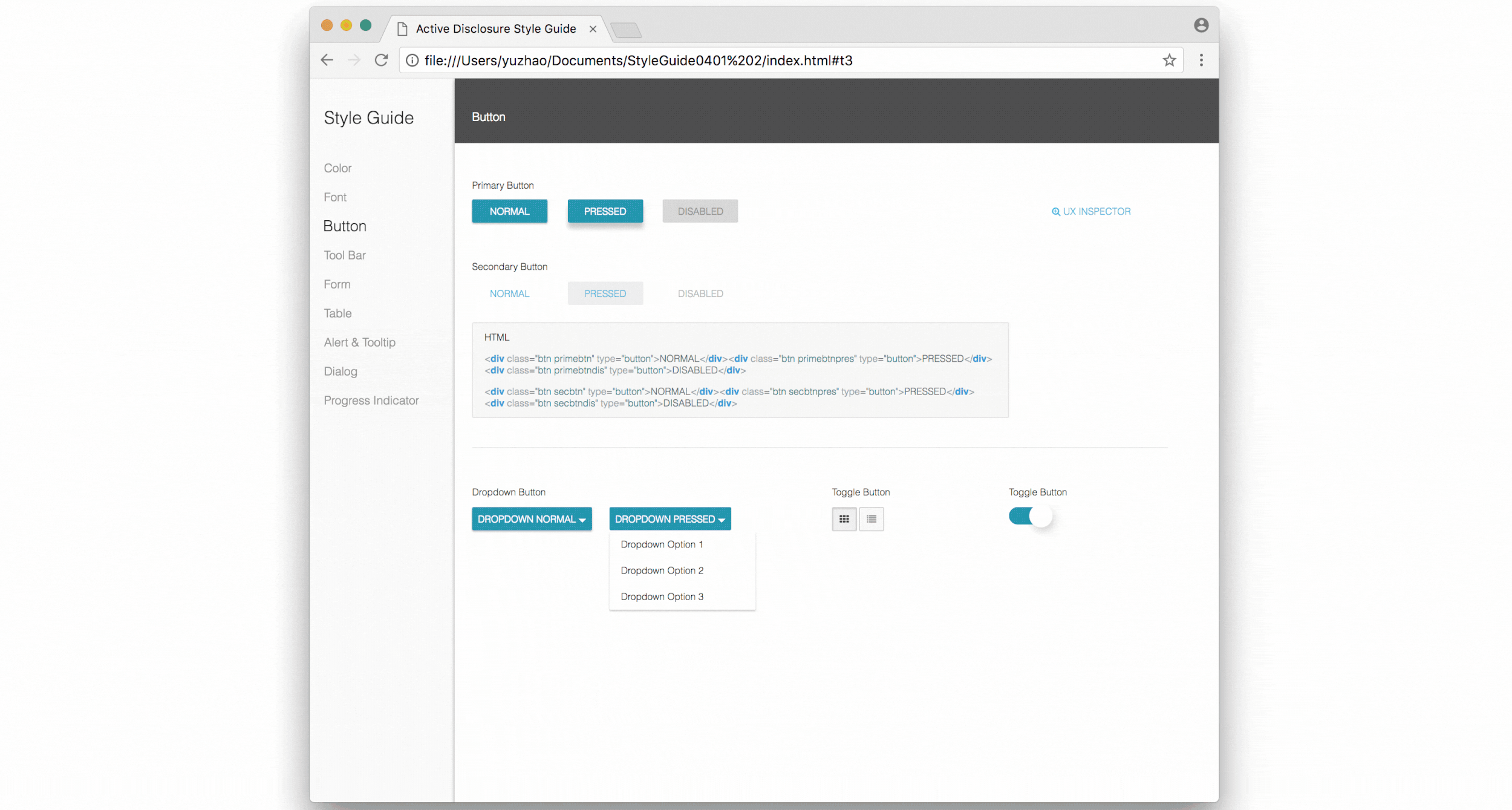
Style Guide
I created a UI kit first, and tested it out on over 10 main views to see if we could apply Material Design style to our product. Later I created the style guide using HTML and CSS for the design team and development team to follow. This style guide was meant to serve as a single source of truth for the UI so that both teams remained on the same page and maintained clear communication. With the development team being located in Ukraine, this was especially essential!
Swimming In a Sea of Redlines
Along with the style guide, we also handed off tons of redlines to the dev team to make sure the re-skin would be correctly implemented. While the reskin only included light user flow improvements and layout changes, our developers were more experienced in the backend and required thorough documentation - especially as they often worked opposite hours from us. Another excellent designer and I almost drowned in the sea of redlines. But it was worth it!
While one dev team was working on the UI implementation, the other designer and I started to do interaction design for the main features. Process to design each feature: User Needs / Issue Finding → Define Minimum Viable Product (MVP) Scope → User Flow → Whiteboarding → Wireframes → UI Design → Evaluation
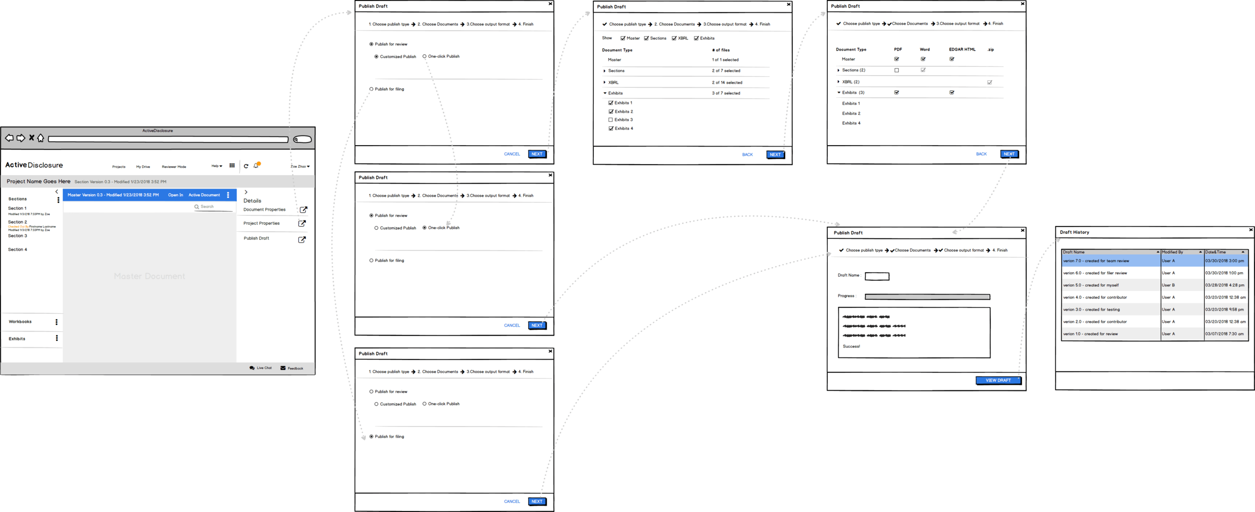
Here’s an example how I designed one of the most critical features called "Publish Draft", its purpose is to convert files to different formats and then pack them up for SEC filing or for team review.
After the design is done, I'd first get feedback from the internal user - Business Support Group, and iterate the design. After release, I monitor the Net Promoter Score (NPS) from the external customer survey and keep tracking feedback gathered by Salesforce. And we've got good news!
Big Impact
After using ActiveDisclosure to file, users are asked to complete a short survey. The survey tells us how likely a customer is to recommend ActiveDisclosure or use ActiveDisclosure again should they change companies. The report above shows that for several quarters in 2017 we averaged an approximate 55 NPS score. In 2017 Q4 we started to see improvements, and after we released the redesign later that quarter, the NPS score shot up to 85! Some of this improvement can be attributed to fixed performance bugs, but the uptick in scores aligns precisely with the release of the new UI. This strongly suggests that our work had a significant impact!